SQL and results
Charts
Turning a query result into a chart on the Chart tab, the options it has, and saving it as an image.
Every result can be drawn as a chart. Run a query, then open the Chart tab next to Table under the editor. mxds picks the columns for a first chart; you change what you need in the panel on the left of the chart.
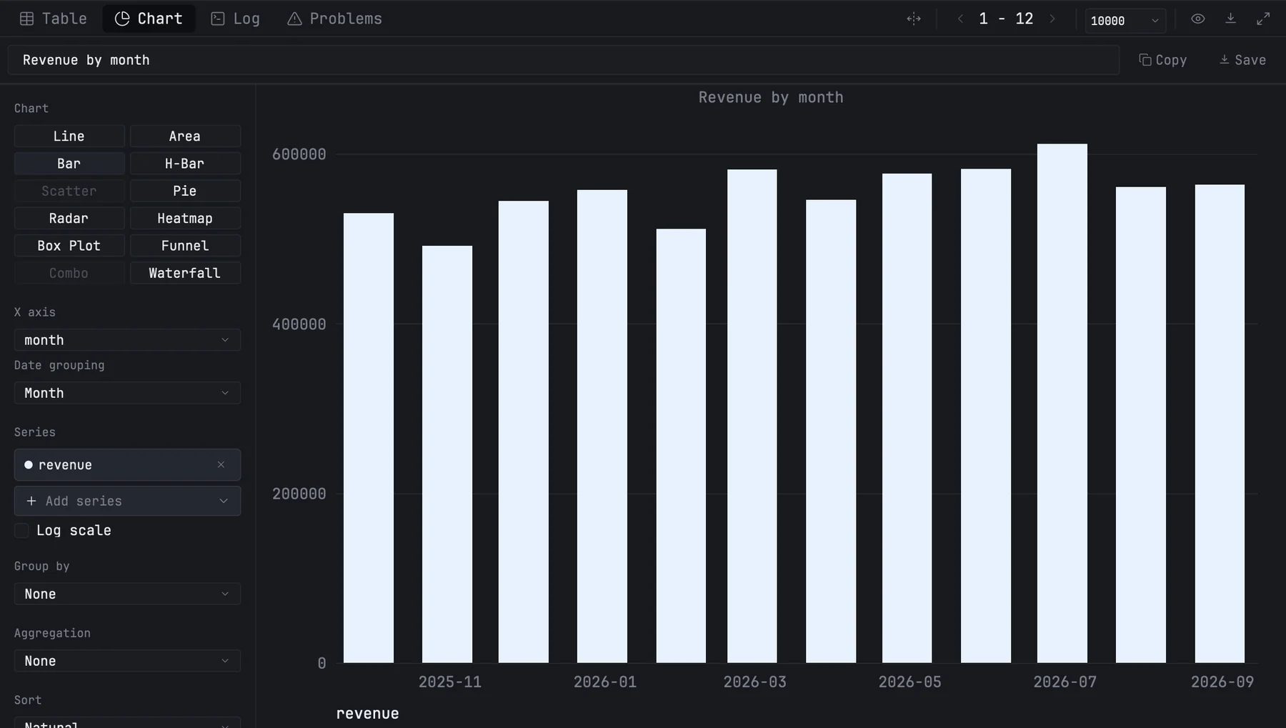
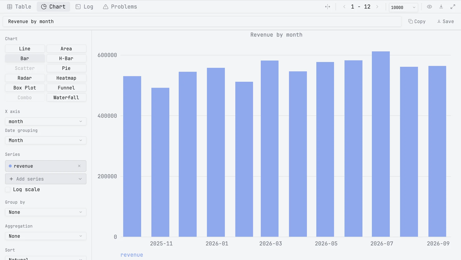
Chart kinds
| Kind | Needs |
|---|---|
| Line, Area, Bar, H-Bar, Box Plot | any column on X and one or more number columns |
| Pie, Funnel, Waterfall | a category column and one number column |
| Scatter | a number column on X and one or more number columns |
| Radar | at least 3 categories and number columns that are not negative |
| Heatmap | a category column and several number columns, or one number column with Group by |
| Combo | at least two number columns: the first is drawn as bars, the rest as lines |
A kind the result cannot feed is greyed out; hover any kind to see what it needs. A new chart starts as a bar chart.
How the first chart is picked
- X is the first date column, or else the first text column, or else the first column.
- Values are up to three number columns. Columns that look like keys, such as
id,rankorcustomer_id, are skipped. - When X is a date, Date grouping starts at the unit the dates already have: daily rows stay one bar per day, one row per month is grouped by month, and timestamps with a time of day are not grouped. Once you choose an Aggregation, mxds groups by day, week, month, quarter or year, depending on how long a period the data covers, and labels the axis in that unit —
2025-01for a month. A grouping you picked yourself stays.
Options
The panel on the left has these sections, from the top:
| Section | What it does |
|---|---|
| Chart | the chart kind |
| X axis | the column along the axis. It is called Categories for kinds that have no axis, such as Pie. For a date column, Date grouping sets the bucket: none, day, week, month, quarter or year |
| Series | the number columns to draw. Add series opens a list of them; the × on a series removes it. Kinds that take one column call this Value. Log scale is under it — see below |
| Group by | splits the values by another column, one series per value |
| Aggregation | none, sum, average, count, min, max or median of the values for each X |
| Sort | natural, ascending, descending, or the order of the result. It sorts by X |
| Style | depending on the kind: stacked, smooth lines, donut, horizontal funnel, legend, grid, value labels, and a separate axis for the lines of a combo chart. With the grid off, the zero line stays |
The field at the top of the chart is its title. It is drawn on the chart and used as the file name when you save it.
When the results pane is narrow, the panel hides; the gear button at the top shows it over the chart.
Log scale
Log scale puts the value axis on a logarithmic scale, so 1, 10, 100, 1k and 10k sit the same distance apart and small values stay visible next to large ones. It works for Line, Area, Bar, H-Bar, Scatter, Box Plot and Combo (both of its axes); for the other kinds it is greyed out. A log axis has no place for zero or a negative number, so those values are not drawn — a line breaks there — and the chart says how many were left out. A box plot still works out its quartiles and whiskers from every value, zero and negatives included; a box or whisker that reaches zero is cut off at the bottom of the chart, and the note says how many boxes were.
What the chart reads
The chart reads the whole result, not just the page the table is showing. It does not follow the table's sort, filters or search.
Pie charts show the 11 largest categories and Bar and H-Bar charts the 29 largest; the rest are added up into one more slice or bar called Other. A Bar or H-Bar chart over a date column keeps every date, so a timeline is never cut short. Above about 10,000 bars, cells or boxes, the chart asks you to choose an aggregation or filter the query first.
Reading a chart
- Hover to see the values under the pointer. Pie charts also show each slice's share.
- Drag up or down along the value axis to stretch or squeeze it; double-click the axis to go back to the automatic range. For H-Bar, drag along the bottom axis.
- When the legend does not fit, ‹ and › page through the series.
Saving a chart
- Copy puts the chart on the clipboard as a PNG image.
- Save offers PNG or SVG and opens a save dialog, in
~/.mxds/charts/by default.
The image is the chart as it is on screen: the same size, colours and value-axis range.
Each query tab remembers its chart, including after you quit and reopen mxds. When you run the query again, the X, series and Group by you picked stay as long as their columns are still in the result; a column that is gone is picked afresh.
Charts from your agents
An agent in the mxds terminal can draw the active tab's result:
mxds chart types
mxds chart build line day revenue,cost --title "Daily revenue"
The arguments are the kind, the X column and the value columns, comma-separated. The Chart tab opens with the active tab's result; --result with a result's id charts that result instead, in the tab that shows it. Agents connected through MCP use the chart_build tool.